 Ahmed Elflal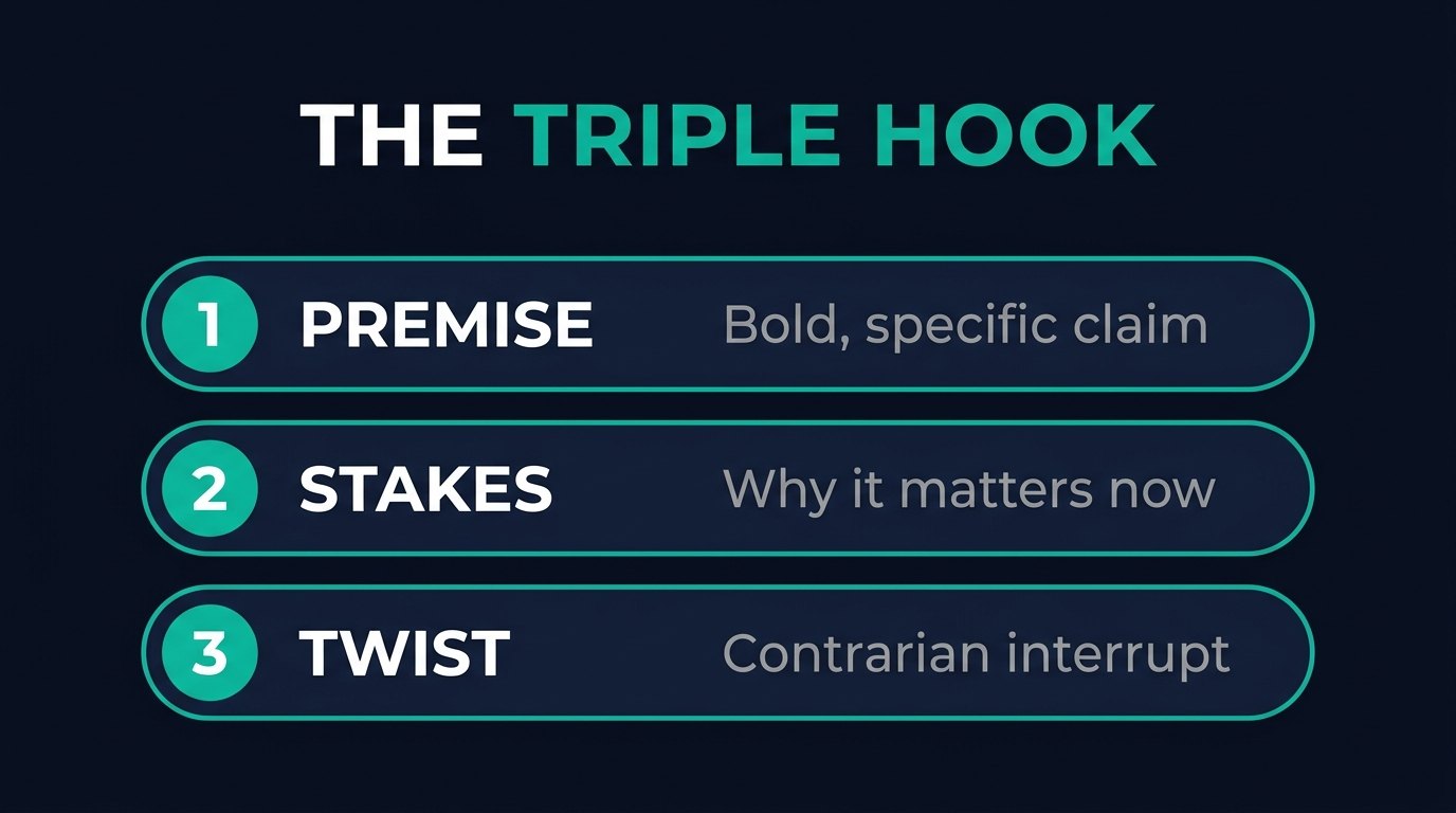
Most ad copy tries to be clever.
The copy that actually converts is not clever. It is structured.
After testing across more than $30,000 a month in ad spend, the pattern that consistently stops the scroll and pulls qualified people through is the same every time.
A Triple Hook on top. Then a fixed body structure underneath.
Here is the exact formula, and why each piece is doing a specific job.
Good ad copy filters before the click
The point of the copy is not maximum clicks. It is the right clicks.
Every unqualified lead costs you twice. Once for the click, and again for the sales time wasted on it.
So the copy is built to pull in the buyer and quietly repel everyone else, before they ever reach the form.
The Triple Hook: stop the scroll in three seconds
The opening is three hooks stacked. A structure I learned from Travis Stephenson and have run ever since, because it works.
Each hook has one job.
1. The Premise Hook
A bold, specific, credible claim.
Specific numbers beat vague promises every time.
"My business is making over $7,000 a day" or "I came back to 83 Stripe notifications totaling $19,400" stops the thumb, because it is concrete.
Vague claims get scrolled past.
2. The Stakes Hook
Now tell them why it matters.
What is at risk. Why they need to pay attention. Why this is relevant to their situation.
"Most coaching businesses collapse the moment you step away" raises the stakes, so the reader leans in instead of drifting.
3. The Twist Hook
A pattern interrupt that challenges what they believe. The contrarian reveal.
"...and virtually nobody knows who I am."
"The most profitable businesses are not built on hustle, they are built on systems that run while you do not."
The twist breaks the assumption and earns the rest of the read.
The full ad structure
Under the hook, the body follows one order, every time. This is the structure I do not skip:
- Call-out so the right person knows it is for them (without the banned "are you struggling with..." phrasing).
- Hook, the Triple Hook above.
- Intro / shock statement that expands the hook into a story.
- Problem, named in their exact language.
- Agitation, what the problem is costing them and why other fixes failed.
- Solution, your offer presented as the bridge.
- Bullet-point formula / irresistible offer, the value laid out so it feels obvious.
- Social proof / authority, results and credibility that lower the risk of believing you.
- Urgency, an honest reason to act now.
- CTA, one clear next step.
That sequence is not decoration.
It mirrors how a skeptical buyer actually moves: from "what is this," to "this is for me," to "I will act."
The psychological layer
Inside that structure, a few triggers do the heavy lifting.
Nuggets of desire tie the offer to the outcome they actually want ("your life goes from having to choose, to having a choice").
An identity-transformation line shows who they become after buying, not just what they get.
And transition phrases ("the truth is," "which means," "here is what most people miss") keep them sliding from one line to the next instead of dropping off.
Write it for the phone, and keep it compliant
Almost everyone reads this on mobile. So the format matters as much as the words.
Short paragraphs of two to three lines. White space. The important information front-loaded in the first two lines.
And keep it native: story-based, specific, provable, educational in angle.
Skip the exaggerated claims, the direct "are you struggling" targeting, and anything you cannot back up.
Story that feels real beats hype that gets flagged.
Test it the right way
Start by testing three different Triple Hook combinations. Then story versus direct. Then CTA variations.
Change one element at a time.
Let each ad run three to five days before you judge it. Then scale the winners aggressively and kill the losers fast.
A 2% or better click-through rate is a healthy signal. But the number that matters is cost per qualified lead, not clicks.